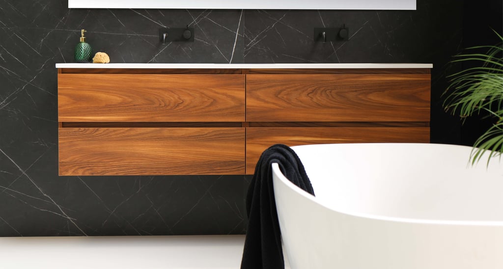
The feeling’s neutral: guide to tonal interiors
Our designers discuss why less is more and the science of calm.


Take a moment to leaf through the pages of any interior design magazine right now, and you will notice that monochromatic hues are back in vogue. It’s not that we care about following the trend at Torin, but it is obvious that some ideas are simply timeless. A tonal interior essentially means picking one core color and offsetting it with different shades from the same color group. Sounds simple, right?
Well, tonal design is easy to understand but tricky to execute. There is a reason why 50 Shades Of Grey isn’t for everyone, after all. If you’re just starting out, stick to neutral, white, or beige color palettes as it is harder to go wrong than with bolder shades.
As designers, we use tonal decoration to make a space feel expansive and calming. It is particularly useful in bathrooms. One thing to make sure of when decorating a neutral interior is to have the right balance of “warm and cool” undertones. Otherwise, things will get very plain, very fast.

